Themes
Control Center ships a light and a dark theme. Each user selects one from /settings,
or leaves it on System Default to follow the operating system. The preference is
stored per user in the database and mirrored in browser storage, so the chosen theme is
painted on first load without flashing the wrong one.
Both themes are built from the same set of CSS custom properties, so anything you override below applies in either mode.
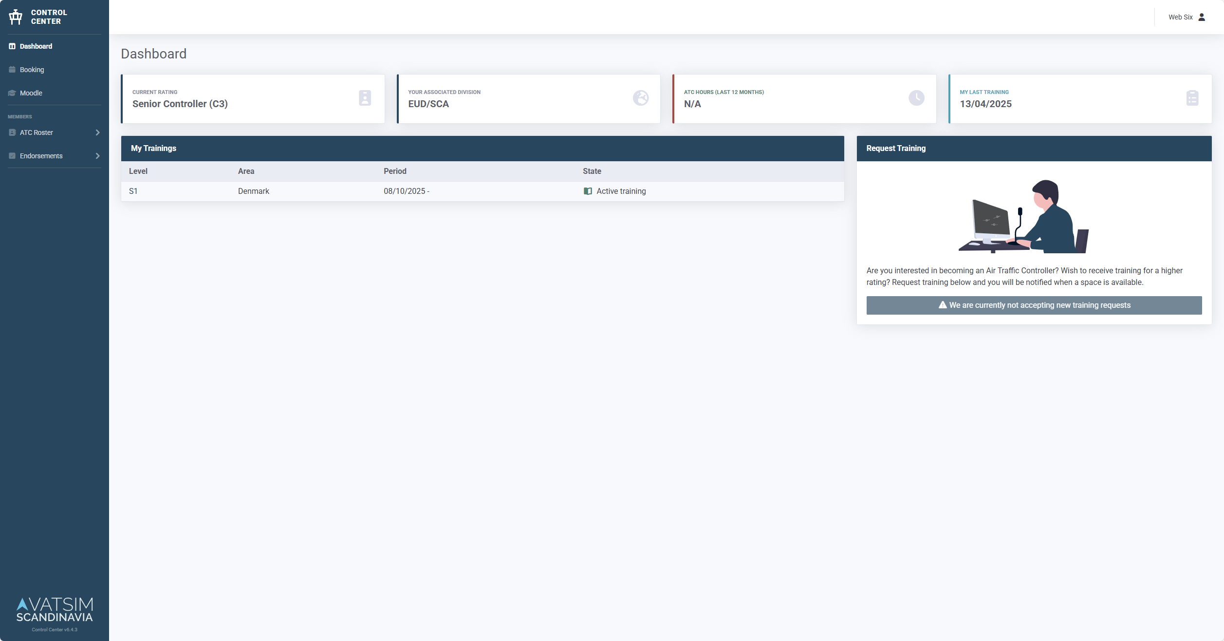
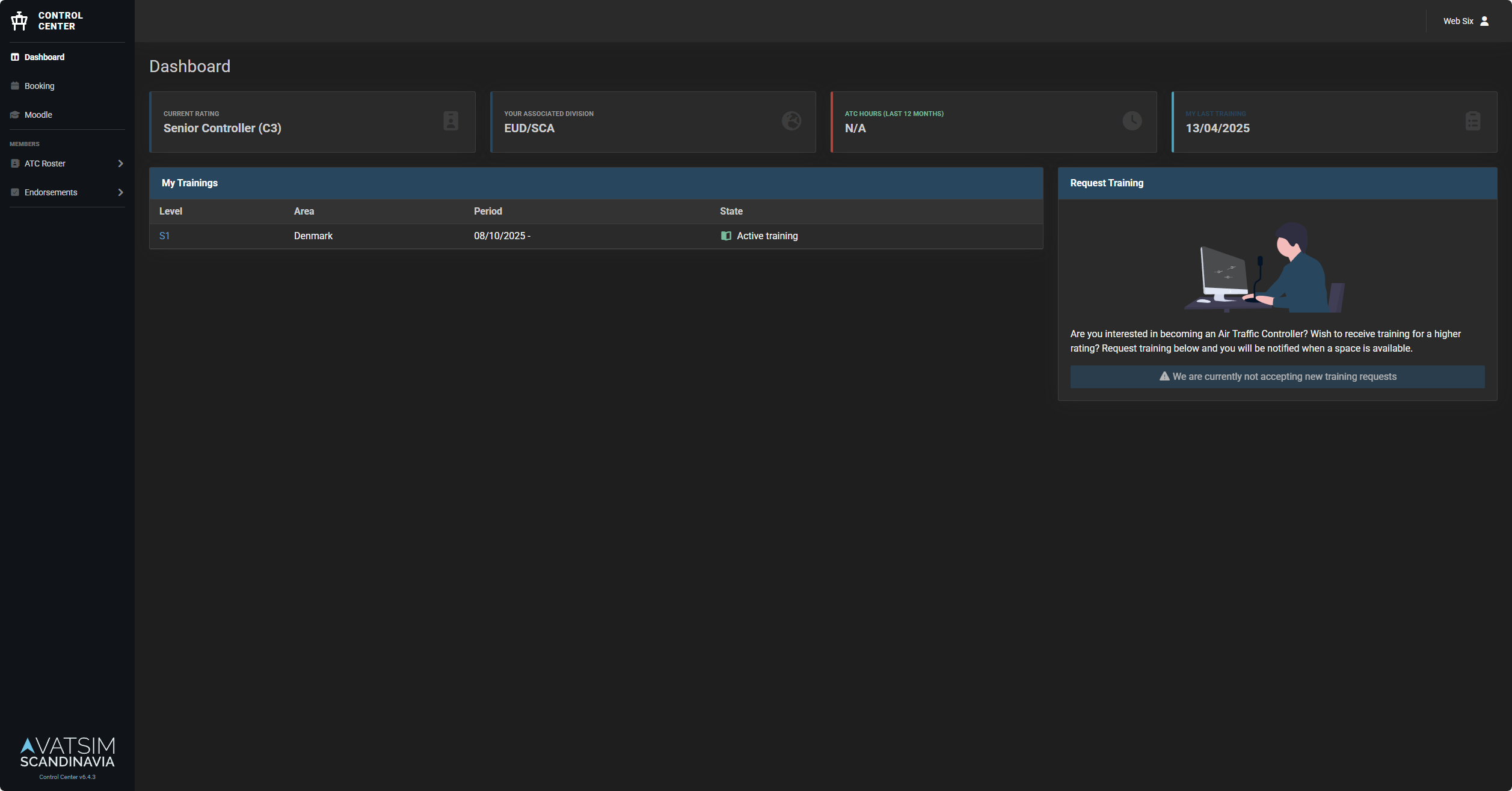
Customizing Theme
To brand your instance, put your overrides in resources/sass/themes/_custom.scss.
That file is git-ignored, so your styles stay out of version control while still
compiling into the regular front-end build.
1. Create the override file
Copy the example to get started:
cp resources/sass/themes/_custom.scss.example resources/sass/themes/_custom.scss
2. Edit your colors
Edit resources/sass/themes/_custom.scss. Override only what you need.
Anything left out keeps its default.
Reference for the available values:
resources/sass/themes/_light.scss: CSS custom properties for the light themeresources/sass/themes/_dark.scss: CSS custom properties for the dark themeresources/sass/_variables.scss: SCSS variables consumed by Bootstrap
3. Rebuild the assets
The CSS is compiled ahead of time, so the override only takes effect once the front-end is rebuilt. How you do that depends on how you run Control Center.
npm run build
Build your own image with the override baked in. See Custom container image.
Don't build inside a running container
The published image contains no Node toolchain, and anything compiled into a running container is lost the moment it is recreated. Either bake the theme into an image you build yourself, or run Control Center without a container.
Troubleshooting
Theme not changing
- Clear browser cache (Ctrl+Shift+R / Cmd+Shift+R)
- Check JavaScript console for errors
- Verify assets are built:
npm run build
Colors look wrong
- Ensure you edited both the light and dark blocks in
_custom.scssso the colors match in either mode - Rebuild assets after changes
- Check CSS variables in browser DevTools
Further Reading
- Custom Container - Persistent customizations